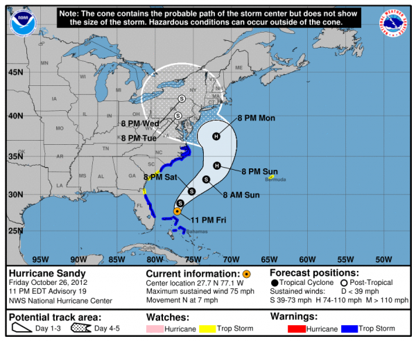
Without being told how to interpret it, what do you think it says?
It looks as if the hurricane will grow into a monster storm that will swallow every space from Washington to Toronto to Boston. But … that’s far from the correct interpretation. What this map actually shows is a range of possible paths that a storm (in this case, 2012’s Superstorm Sandy) might take over the next five days. The white shaded region projects one to three days out; the dotted region projects four to five days out. The black and white circles along the center line of each region indicate the most likely path for the eye of the storm, and the letters labeling the circles indicate whether the storm is a tropical storm (S) or a hurricane (H).
All this information combined makes up a “cone of uncertainty” and represents a 67% confidence level for where the storm might actually go. In other words, there’s only a 2 in 3 chance that it will actually end up within the boundaries drawn.
https://www.technologyreview.com/s/612302/designers-are-reinventing-hurricane-maps-for-an-era-of-extreme-weather/
No comments:
Post a Comment