I’m back with yet another GIF animation because I think I’ve developed a mild addiction to them[Editor’s note: that’s a classic denial by a serious addict]. Words mean one thing, but movies, well, they can reveal a lot. In this case, we wanted to show you every single North American multi-model ensemble forecast for ENSO over the past year and a half. This does not include every model that forecasters consider when developing their consensus outlook, but it includes a lot of them.
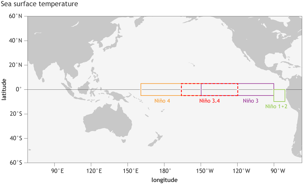
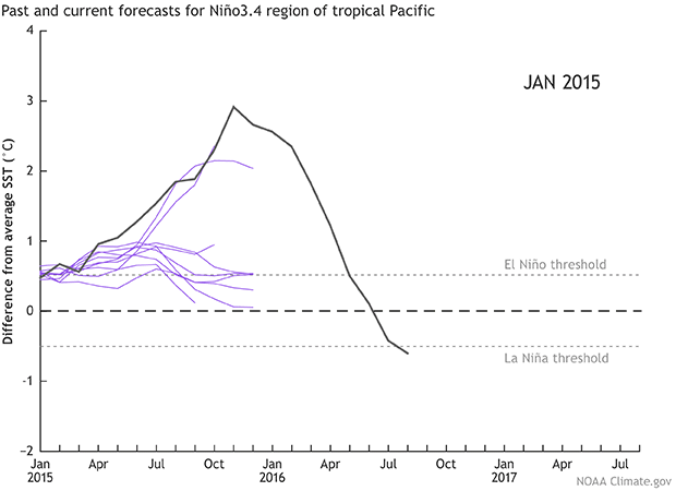
This particular animation displays once-a-month data of sea surface temperature departures averaged in the Niño-3.4 region in the equatorial Pacific Ocean, which is one key location to monitor ENSO variations. Persistent positive numbers in excess of +0.5°C indicate El Niño, and persistent negative numbers less than -0.5°C indicate La Niña.
Black line: these are the Niño-3.4 (ENSO) observations for each month starting in January 2015 and ending in August 2016
Purple lines: each line represents a forecast from a different model (1). There are 9 models shown in this animation, which are run at the beginning of each month (by the 6th-8th of each month) by various researchers and agencies across North America. The year and month in the upper right corner tells you when the model prediction was made. We like to examine different models because it is the forecasting equivalent of crowd sourcing. In climate prediction, no one model is clearly better than the rest, so this allows us to see the potential range of outcomes.
Grey lines: Showing the past model forecasts dating back to January 2015 (2).
Okay, now watch it until the room spins—I mean just a few times—and I’ll point out some of the more interesting features below:
No comments:
Post a Comment